Typography is a huge part of design and design is a huge part of type. You can’t just throw text on a page, it has to be laid out and organized in a clean way that adds to the information being presented. Here are 11 typography tips to help you convey information in print the right way.
1. Use Grid-Based Layouts
Grid’s are the basic underlying structure of almost everything you will do in design, especially printing. They help to create a nice clean layout, so use them. Before you even get to the type, layout the page with a grid.
Grids are simply a structure of columns and rows.Typically, when someone mentions a grid, one may think of even lines and columns, all the same size. In print, you don’t want everything to be the same size. A variation in size is required for a well-structured layout. A standard layout usually consists of one or two columns, but be original and use a three, four, maybe even a five column layout. Remember that these columns need to fit onto the page, and each time you add a new column you have to shrink the other columns.
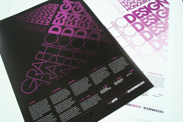
This page is an excellent example of a grid-based layout. It uses a very complex grid to organize all the type and graphic elements into a organized and readable layout. Also note, the grid isn’t perfectly defined, some objects flow over the borders.
2. Alignment
Speaking of layout, I’ll talk about alignment too. Alignment is one more option that has a strong impact on the layout. For a more standard print layout, it is obvious that the body text should be left aligned. For headers, most people may say it needs to be centered, but centered text headers can often throw off the layout. Left aligned is almost always the way to go, especially with bold text elements. Right aligned can also work too. Occasionally, a whole page can work right aligned, but often times it won’t look good. Using a right alignment on smaller text items such as footnotes or captions may work with a left aligned layout.
If your body text is left aligned, be consistent and make everything else on the page left aligned. The most important factor in aligning is to be sure to make everything line up at the same spot. This is where your grid comes into play. Every text object should be the exact same distance from the left (or right).
3. Don’t Be Constrained To The Paper
The size of the paper you are printing on can be a real pain sometimes, because it’s hard to fit all your type on the page. The solution is to go off the page. All of the text, doesn’t have to be inside the small constraints of the page, you can let text flow off the page. What do I mean? Instead of fitting all of the text, crop parts off by allowing text to flow off the page. If you cut off a small part of a letter or word, people will still get the message, and you will get more white space. Be careful not to cut off too much though. Keep it to a point where the text can still be read the same way one would read it if it was completely on the paper.
This layout extends off the page, but is still completely readable. Also, it uses good repetition, which I will talk about later.
4. Spacing, Margins, Kerning, and Leading
Using good spacing and perfectly sized margins is probably one of the most important aspects of printing and typography. Even the smallest space can affect how someone looks at the design.
The whole point of what you are doing is the content, so spend some time on readability. Take a look at the kerning, the space between the individual letters, and the leading, the space between baselines of text. Leading and kerning are the most important aspect of the body text. If the leading is to large, it can be distracting because there is too much white space. Make the leading to small, and the reader will be strained trying to read the text.
5. Contrasts
Colors and their contrast can sometimes be difficult. It’s one of those situations where it can look really good or not work at all. Like with kerning and leading, bad contrasts can make text unreadable. Finding the perfect balance for the body text is challenging; it needs to be strong enough to be visible, but not so strong that it becomes distracting.
Contrast is yet another technique for defining headings and important objects. The level of contrast can help make an object pop, or make the object more subtle. Use a strong contrast for text such as headings that you want to be noticed immediately.
While on the topic of coloring, I’ll mention the use of inverting colors to bring attention to text. For example, instead of using black text on white, use white text on black.
6. Overlap Objects
I just mentioned that you should stick with a grid layout. Well, I lied. You should use a grid layout, but you shouldn’t constrain yourself to a perfect grid. Instead, try overlapping text and graphic elements.
Now, overlapping won’t work in every layout, but sometimes it can look very clean and organized. First of all, you can only overlap objects of different color or transparency. Otherwise, it will look jumbled and confusing.
This is probably one of the best layouts I have seen. It uses a grid, good headers, and overlapping objects.Take a look at the quote on the left page. It is overlapping the body text, but both are still completely readable.

7. Switch it Up, But Be Consistent at the Same Time
When making a multi-page layout, you must stay consistent with colors, fonts, and sizes throughout all the pages.
I did say switch it up though. What I mean is that you need to alternate the layout of the typeface. Since you’re working with a grid-based system, alternate the layout of the grid. Change the number of columns and rows, and the size of each. Try to do this while still carrying the “feel” of the other pages.
8. Make a Harmony With the Graphic Elements
Don’t forget that typography isn’t the only part of print, you have to incorporate images and other graphic elements. The type must be laid out in a way that it flows with the graphic elements, such as an image. There are a few techniques to get your layout to flow. First is spacing (spacing is obviously very important today). Create a appropriately sized margin between the image and the text. You could also take the exact opposite route, which would be to lay the text over the image. You could position the text directly on the image, but it’s probably best to have the text flow off the image.
Here is a good example of text overlying the image. Notice how a transparency was used so the image is still visible.

Take a look at how this magazine organizes the text elements on top of the large background image.
9. Make it Interesting
I talked about the importance of white space, but white space doesn’t necessarily mean a minimalist layout. In print, minimalist is useful, but you can’t be too minimalist. Print has to be interesting and intriguing. How does one go about making type more interesting? There are many ways.
Appealing Colors – First, use interesting colors that are appealing to the eye. Avoiding using the standard black and white. To go along with that, make sure to use more than one text color in the typeface. Use different colors for different items in the hierarchy.
Repetition – Another technique is repeating text objects over a page. Repeating words to form certain shapes also looks nice too. Just make sure the repetitive words don’t take attention away from the main content if being used on a page with other important elements.
10. Remember the Hierarchy
The hierarchy is the term used to describe the variation in typographic elements such as headings and text. In other words, this means that you need to have a variation in sizes and weights between headings and body text. Variation in size is necessary, because it allows the reader to recognize a distinct difference between such items in the typeface.
Headings are one more thing you have to be careful with. The reader sees a heading first. Make the heading good enough that it get’s someone wanting more.
Also, keep in mind that the hierarchy doesn’t have to be in a set order. You can place a heading next to text instead of simply placing it on top.
11. White Space: Nothing is Everything
Believe it or not, a big element in print is nothing. White space provides a professional and minimalistic feel, but it can still be incorporated into a complex layout. Using a lot of white space in print is a smart practice, but only if it used correctly. A good way to integrate it with typography is to keep all the type in a small area on the page, and leave everything else as white space. This creates a very clean and pleasant look.
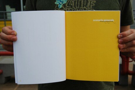
Take a look at the two pages below. Now this is taking it to the extreme, using nothing but space, but it is a good example of how nothing can add something.
What Do You Think is Essential?
Please, feel free to add anything or share your opinion.

{ 50 comments… read them below or add one }
← Previous Comments
Great post! A good reading in the cold morning thanks!
Thanks so much for this article and for going really in depth in your descriptions. This is something I need to learn about and your article provides a great jumping off point.
Nice post. Brockmann’s book on grid systems in graphic design is a great resource for designing for print:
http://www.youworkforthem.com/product.php?sku=P0004
I feel like paper size and other constraints can actually help you focus on content; and print production (offset, letterpress, etc) can greatly enhance a final piece. Jeff
@jeff
You do have a point there, and thanks for the link!
Great Read! Well put together I really enjoyed this and plan to share it with a couple of people at work.
~ Aaron I
I love good typography in print. There just seems to be so little of it.
Great post Matt, and with excellent, beautiful examples! Keep up the great work.
Very nice article, need to give this to my art teacher, who although is knowledgeable on the topic, fails at communicating this to our class.
Lucky they have me XD !!
That’s very interesting post, I’ve learned a lot .. DIGG
This is a great article and reminder, great examples, I want to improve my type skills for 09 :o)
Nice article. Grids are a hot topic these days and I love all the discussion about it. As mentioned, breaking the grid should not be overlooked either.
Great overview…. : )
Great article!
Good to always reiterate the basics, which still work year after year, no matter how zany or conservative a design is.
I would just add the rule of proximity, which is that like items go together. This is something so often overlooked by amateur designers who don’t have a grasp of the things you discussed.
This can happen on a small scale (a bullet too far away from its accompanying text) or a large scale (big white gaps in the middle of the page while the outer margins are smaller).
We associate what is nearest to something as having a relationship. So if two things are not as related as two other things, their space relationship should reflect that. This keeps a layout tight and cohesive.
Nice post! Bookmarked. Thanks
VERY interesting post! Keep with this amazing website
Great post!! Very interesting.
Really useful and uncluttered explanation
This is an amazing list!
Real nice and simple article with a great breakdown. Thanks.
awesome article, you found yourself a subscriber
“White Space: Nothing is Everything” totally agree, nothingness is part of the design!
A lot of great detail in this article! Also, a great list to keep on hand for everything!
Thank you!
hello! im visiting and, by surprise, i foun a job that i have done (the overlaping yellow one), thanks a lot to use it as example! enjoy!
Great, informative, gives you nice perspective in essential typography use in design.
Thanks
Spectacular examples. Simple and poignant.
Great article, well presented – thanks for sharing.
The layout under Don’t Be Constrained To The Paper — Looks Fantastic! Made me think, “why have i never tried that”
Thanks for sharing!
Beautiful examples of layouts and designs. Great tips!
Great post! Thanks! Love to share it with my group if that’s okay? Thanks for sharing.
It’s fantastic to see such a collection of great and varied graphic design… with concise and easy-to-understand definations of just how the design shown works! Great job!
Although at uni I studied print design, I’ve become more of a web designer…and one of the things I’ve been trying to develop is adapting print design concepts for on-screen…without using flash. I’m a bit hard-core in that respect. Pure HTML and CSS only for me.
a great “put-together” article. Save it, print it and keep read it before designing. Thanks!
A well put together article. However, make sure you don’t mix up kerning and its close relative tracking. You mention the importance of good kerning twice… kerning is individual spacing between letters. This is only applicable to headings and individual large-type situations. Instead, when referring to body copy, you want to talk about tracking, the general space between letters applied across all text. (You should therefore change your references to kerning to talk about tracking instead.)
Good point Jared, well spotted! I had to double check that one on Wikipedia. But then it’s a pretty common mistake, even my college tutors would refer ONLY to kerning, as opposed to letter-spacing or tracking… I shall have to remember that in future myself! Thanks for the quick lesson on Typography Terminology
And once again, thanks for such a great article, I’ve love the examples so much I’ve been back everyday since finding it, just for some inspiration!
and one more thing – CMYK colors – be prepared that not every color You can get on a screen is going to print. And always keep in mind that it is going to look different when printed.
Enjoyed it. Thanks for the input. Really helps me as a student.
wow , Great post
I like it…
Blogs like this are why I use the internet.
Great article! Typography is the basis of a good design, specially in prints. Using the principles of Gestalt also helps a lot and many points you’ve listed are common. Have you read “A Primer of Visual Literacy” by Donis A. Dondis? Everyone should read it. It’s talks about the relationship between things and the meaning of it. Great!
douche
im gay i like men
I is amazing… and jonno dun has teh recons armor…
Nice article. I’m sure you could do an update on this to cover new techniques that have come about.
Great post! Thanks for sharing it.
If you don’t mind I’d like to present this page in my Graphic Design course. Do I have your permission. Also I’d like to use some on my blog. This is a great post. You will get credit. Mind? This is a great tool for beginner designers and I love it. It’s perfect! You cover all the steps. There are a few I’m going to add, but this post is awesome! Very clear and informative!
Very nice Typography explanation, congratulations, thanks for good job
Wow~ That’s my style~♥ Thanks!
very interasting!
Hey there, that is my poster on the top. funny – and appreciated.
I’m convinced We have see this exact same sort of affirmation elsewhere, it must be gaining popularity while using people.
I’ll appreciate if you continue this in future. Many people will be benefited from your writing.
{ 20 trackbacks }