Corporate web design is rather simple, because it often follows basic guidelines and trends. Today, we will go over the complete process of creating a clean and relatively simple corporate web design using Adobe Illustrator.
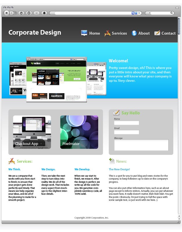
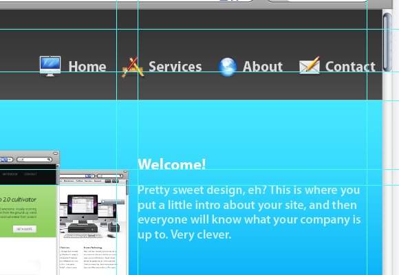
I will talk about the best techniques and approaches to creating a web design started in Illustrator, which is a great tactic. The image below shows what we will be creating. This style of design can be used universally, as it follows many trends, and looks very professional. We will use the most common corporate structure, which consists of a header, an introduction with welcome text and screenshots, and a simple grid-based information layout. After completing the interface in Illustrator, I will go over how to use the Slice Tool to prepare the design for the development stage.
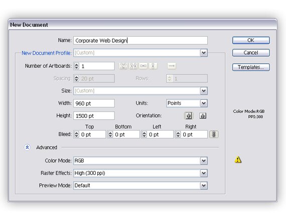
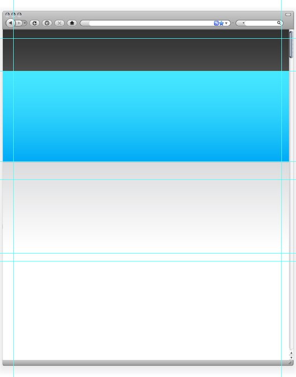
1: New Document
First, we will need to start by creating a new document. Look at the options shown below so you can correctly create the design.
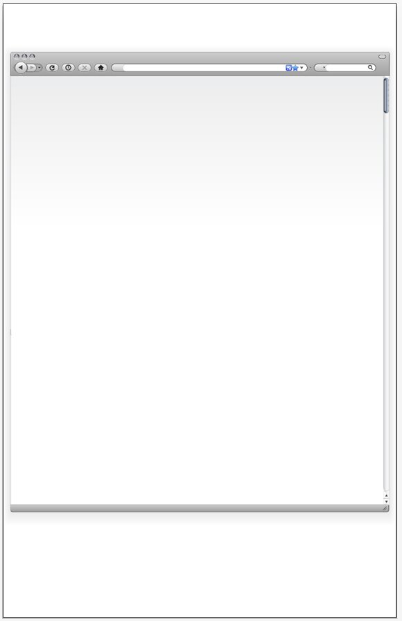
2: Browser Vector Object
After we get the new document created, we will start by making a browser to work within. This will help you to better visualize the design in a browser like environment. This step is actually quite easy, because you can simply download a browser vector set from Vectortuts+. You can find this here.
After you’ve downloaded it, we need to expand it a bit so the design will fit. To do this, select all of the shapes at the bottom, and bring the down. Then, select the scrollbar background and the browser background and extend them down to meet the shapes that you just moved.
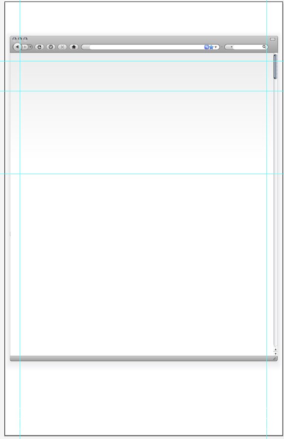
3: Base Guides
In web design, you have to build from the ground up. To get the ball rolling, you with the guides. Grids are the foundation to all web design, so that’s where we need to begin. Here, we need to create our base grid, which will then turn into the sections and divisions for the background.
4: Background Fills
After you get the grid all set, it is time to start adding in some color for the background. In the previous step you divided the page into three sections. The top section will be the header. Fill it with a dark gradient. Next, fill the second section with a vibrant color, going from darker at the bottom to more light at the top. This will be the introduction. After, make a gradient for the content background, or the third section. I filled it with a gradient going from light grey to white, or transparent. To add dimension and detail, I also put in one pixel thick lines at the top and bottom of the intro. The line on the top being a very light blue and the one on the bottom a very dark blue.
5: Grids and Interface Component Base
Now we need to construct a content layout. First, hide the layer with the backgrounds, so it will not distract you. Create grey boxes where you will be placing content and interface elements. Then, place more guides to create a full grid system that is appropriate for the location of you interface components.
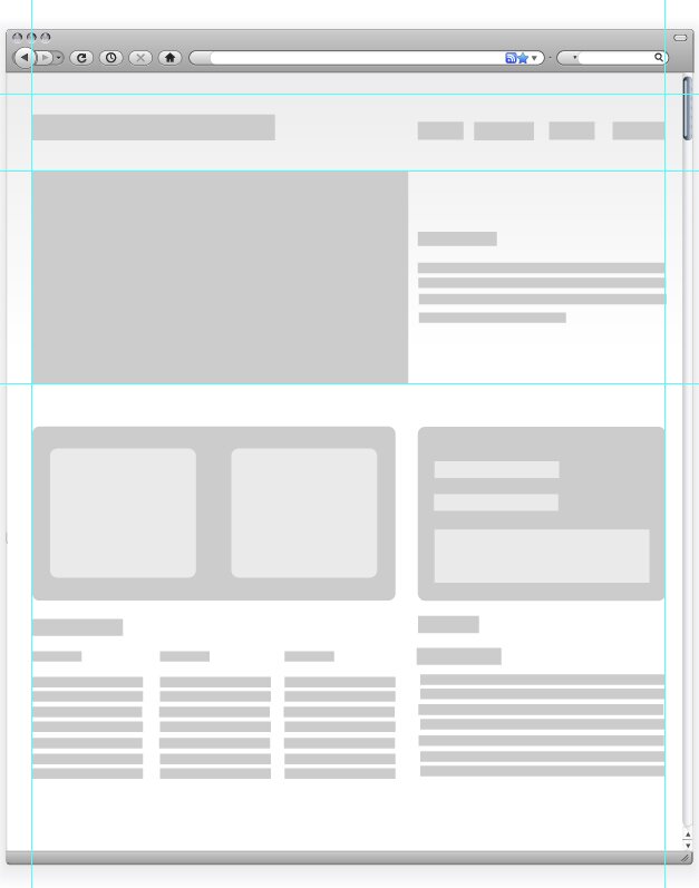
6: Designing Final Interface Components
The next step is to turn our ugly grey boxes into something real, say interface elements and text? So, turn the backgrounds on. Create a new layer above the one with the boxes, and start turning the boxes into elements or text. Be sure you stay in line with the grid you set up. Start adding colors, and play around a bit until you find a color scheme that you like. To create the rounded corners on the shapes, select the shape and then find Effect > Stylize > Round Corners. I used a radius of 10 pixels. Furthermore, I used Myriad Pro for all of my text.
In the image below, you will notice an interface element in the left column. It has two identical gaps, which will eventually hold thumbnails. To remove the gaps, select all three rounded shapes you made in the last step. Then, open the pathfinder window and click “Minus Front.”
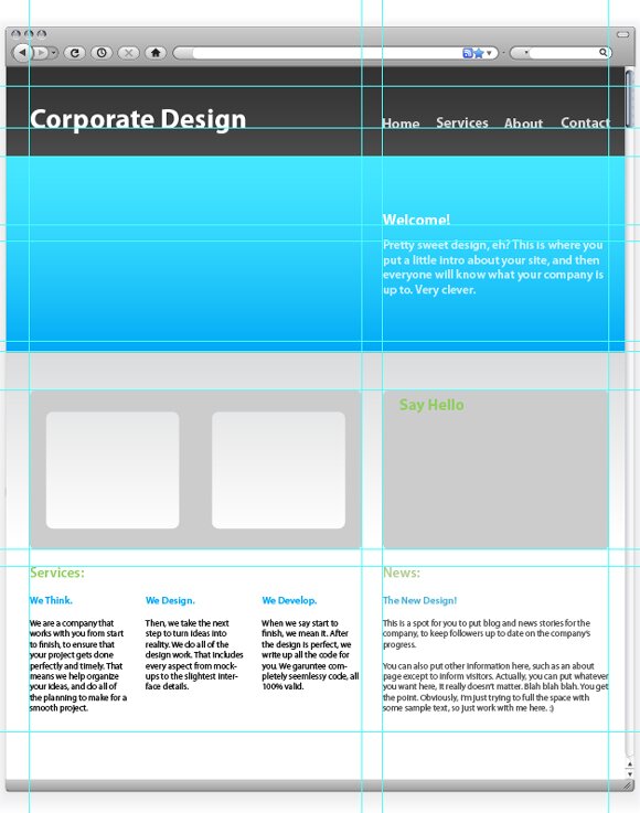
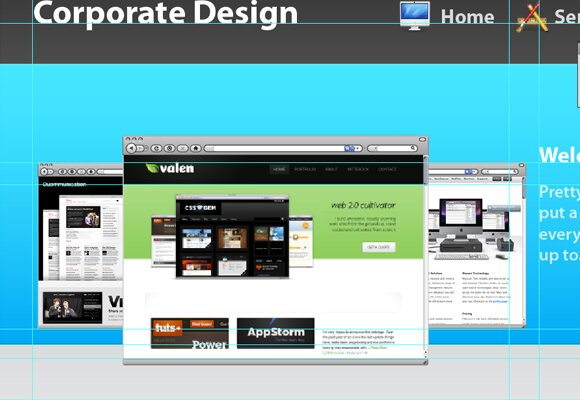
7: Corporate Screenshots
Once you get all of the base interface elements and text, it’s time to go into a little bit more detail. First, we’ll start with the three screenshots in the introduction. Again, we’ll take the vector browser elements that we used early. Move the element into the document, and hold Shift while resizing the browser to keep the dimensions. Place the middle browser, like shown below. Then, make two more smaller browsers and place them next to and behind the middle one. Make sure that the back two browsers are even in size and vertical location.
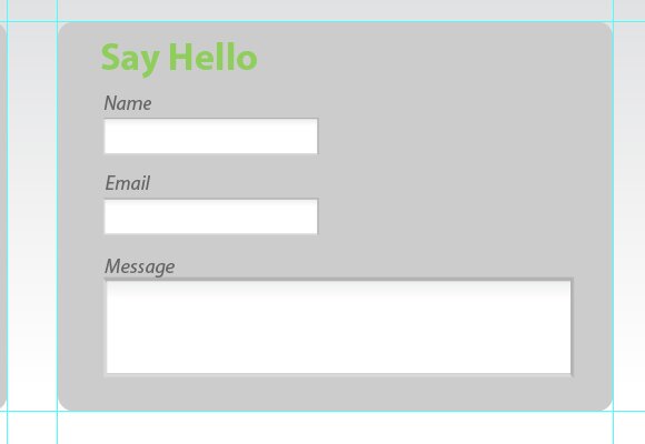
8: Contact Element
Next we will design the contact form. The browser pack also came with elements such as inputs, which you can use instead of plain white boxes. In the box in the right column of your layout, put three inputs, with labels. Use italics and a low contrast for the labels.
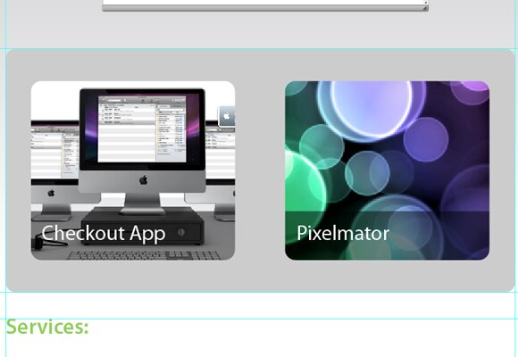
9: Thumbnails
One of the final interface elements is the “portfolio” thumbnails. First, find the element that we created in step 6. Import two small images of about 200 px by 200 px. Place those images behind the element (Right Click > Arrange > Step Backward). Move them to fit behind the grey element so that it acts as a matte to hide the excess of the images.
Of course, there’s always another way to do this. You can also simply import the images and round the corners about 10 pixels. Then, lay it over the grey element.
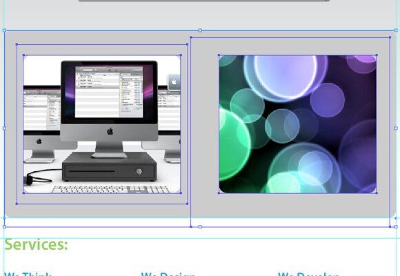
I also added a nice label to the thumbnails. I simply used a black rectangle, with the opacity set to 50%. Then, I used white text as a title.
10: Screenshots
Now we need to insert the screenshots into the browser. The easiest way to do so is to first find the width of your browser. Create a new Photoshop document that size, and paste a screenshot in it. Then, import that into Illustrator; move the screenshot to fit inside the browser seamlessly. You may need to arrange the screenshots by moving them back and forth.
11: Icons
The final set of details is the icons. There are a great deal of icon packs you can find to use that will work beautifully with the design. I simply used a free icon pack, “Jonas Rask Design Icons for Developers.” I placed these icons next to headings and navigation elements, with about a 15 to 20 pixel padding. Below you can see exactly how I worked the icons into the navigation.
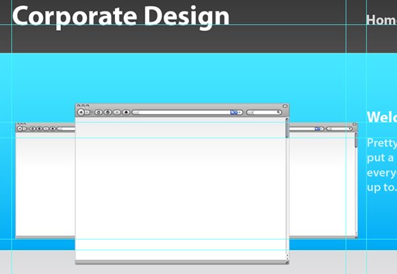
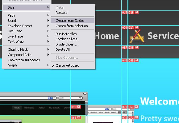
12: Using the Slice Tool
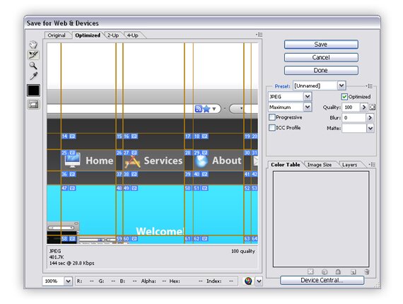
That’s pretty much it, but if you will what to move your design from Illustrator to your development tool you will have to create slices. There are multiple ways to do this. The first is via the guides. You will have to refine your guides slightly to do so. Move your guides so each and every element is in it’s own individual sector. Then, go to Object > Slices > Create from Guides. This will gave you your slices perfectly, just like that. Then, use the Save for Web and Devices tool to save your slices as images to be imported into a web document. You can also select the slices before entering the Save for Web and Devices window, just go with whatever works for you. Remember, to select multiple, hold shift and click the slices. Make sure that when your “Save Optimized As” window opens, you select “Selected Slices” in the final drop down. You can also pick either save as image or HTML document, depending on how you want to move the object to the development stage. With a little bit of coding, you will have a seamless corporate web page, fully styled and functional.
The images below show this process. Here, I was creating separate slices for each button in the navigation. Notice how I only selected the area of the button, and not the padding between buttons.

{ 75 comments… read them below or add one }
← Previous Comments
I believe this is one of the such a lot important info for
me. And i am glad studying your article. However should statement on few general issues,
The web site style is wonderful, the articles is in point of fact excellent : D.
Excellent job, cheers
I savor, result in I discovered exactly what I was looking for.
You have ended my four day long hunt! God Bless you man.
Have a great day. Bye
Inspiring quest there. What occurred after?
Take care!
I was curious if you ever thought of changing the page layout of your blog?
Its very well written; I love what youve got to say.
But maybe you could a little more in the way of content so people could connect with it better.
Youve got an awful lot of text for only having one or 2 pictures.
Maybe you could space it out better?
Have you ever considered creating an ebook or guest authoring on other
sites? I have a blog based on the same ideas you discuss and would love to
have you share some stories/information. I know my visitors would appreciate your work.
If you’re even remotely interested, feel free to shoot me an e-mail.
I loved as much as you’ll receive carried out right here. The sketch is tasteful, your authored subject matter stylish. nonetheless, you command get bought an shakiness over that you wish be delivering the following. unwell unquestionably come more formerly again as exactly the same nearly very often inside case you shield this hike.
My partner and I stumbled over here different web address and thought I might
check things out. I like what I see so now i am following you.
Look forward to finding out about your web page again.
I’m not sure where you are getting your information, but good topic. I needs to spend some time learning much more or understanding more. Thanks for magnificent information I was looking for this info for my mission.
Howdy! I know this is sort of off-topic however I had to ask.
Does managing a well-established website
such as yours require a lot of work? I’m brand new to operating a blog but I do write in my diary daily. I’d like to start a blog so I can easily share my experience and thoughts online.
Please let me know if you have any suggestions or tips for new aspiring blog owners.
Appreciate it!
Thanks for the good writeup. It if truth be told was once a entertainment account it.
Glance complicated to far brought agreeable from you!
By the way, how could we be in contact?
I hardly leave a response, but i did a few searching and wound up herre Design a Clean Corporate Website With Illustrator —
 And, if you are posting at other social sites, I
Soonfed Design. And I actually do have 2 questions for
you iif you don’t mind. Is it simply me or does it look as if like some of these comments look like left by brain dead individuals?
would like to keep up with everything fresh you have to post.
Would you make a list of all of your communal sites like your
Facebook page, twitter feed, or linkedin profile?
I am not sure where you’re getting your info, but great
topic. I needs to spend some time learning more or understanding more.
Thanks for fantastic information I was looking for this information for
my mission.
Excellent post. I was checking continuously this blog and I’m impressed!
Very useful information specially the last part :
) I care for such information a lot. I was looking for this certain info for
a very long time. Thank you and best of luck.
With havin sso much written content do you ever run
into any problems of plagorism or copyright infringement?
My site has a lot of completely unique content I’ve either created myself
or outsourced but it seems a lot of it is popping it up all over the web without my agreement.
Do you know any techniques to help protect against content from being ripped off?
I’d genuinely appreciate it.
Aw, this was an exceptionally nice post. Taking a few minutes and actual
effort to make a top notch article… but what can I say…I hesitate a lot and don’t manage to get anything done.
Your means of describing everything in this post is in fact
fastidious, every one be capable of effortlessly know it, Thankls a lot.
Hey there! This iss my frst comment here so I just wanted to give
a quick shout out and tell you I really enjoy reading through your blog posts.
Can you recommend any other blogs/websites/forums that deal with the same
topics? Thank you so much!
It is perfect time to make some plans for the longer term and it is time
to be happy. I have learn this post and if I may just I wish to suggest you some interesting issues
or tips. Maybe you can write next articles referring to this
article. I desire to learn more issues approximately it!
I do not even know how I enbded up here, but I thought Cheers!
this post was great. I don’t know who you are but definitely you are going to a famous blogger
if you are not already
Today, I went to the beach with my children. I found a sea shell and gave it to
my 4 year old daughter and said “You can hear the ocean if you put this to your ear.” She placed the shell to her ear and screamed.
There wass a hermit crab inside and it pinched her ear. She never wants to go back!
LoL I know this is entirely off topic but I had to tell someone!
Hi, the whole thing iss going perfectly here and
ofcourse every one is sharing facts, that’s truly excellent, keep up writing.
Hi there, You have done a great job. I will definitely digg it and personally recommend to
my friends. I’m sure they’ll be benefited from thyis site.
After which, get a conditioning cap and position this on
the hair. Rest assured that all Progaine products, especially
the Progaine Volumizing Shampoo, are specially designed to cleanse, condition, and style;
there are no regrowth ingredients in this Rogaine shampoo,
compared with other products by Rogaine. Such nourishment keeps
scalp healthy and maintains good hair growth.
Hello, Neat post. There is an issue along with your web site in web explorer, would check this?
IE nonetheless is the market leader and a large component to folks will pass over your wonderful writing due to this problem.
Hi there, yes this paragraph is genuinely nice and I have
learned lot of things from it on the topic of blogging. thanks.
← Previous Comments
{ 17 trackbacks }